How to Write an Event Page That Gets Signups
A conversion-focused event page guide for writing the promise, audience fit, agenda, inclusions, FAQ, and call to action clearly.

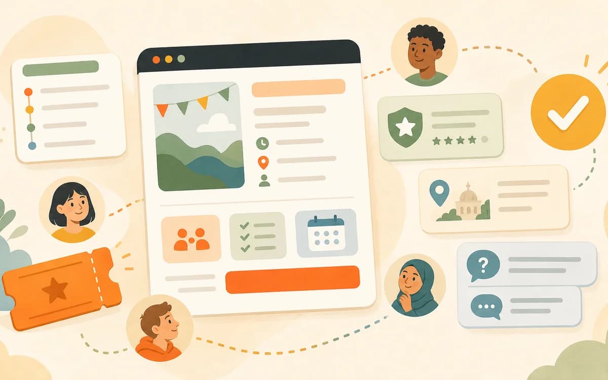
An event page gets signups when it reduces the right uncertainty in the right order. A guest needs to understand what the event is, who it is for, what will happen, what is included, why the host can be trusted with this experience, and how to reserve a spot without friction. Strong event copy is not louder or longer. It is more specific, easier to scan, and honest about the decisions a guest must make before committing time or money.
Key Takeaways
- Lead with the event promise: format, audience, activity, outcome, and time frame.
- Use headings and short sections because most guests scan before they commit.
- Show audience fit, agenda, logistics, inclusions, preparation, and host credibility before or near the signup action.
- Use practical trust details instead of hype, fake scarcity, or inflated credentials.
- Keep the registration form short and explain any custom question the host needs.
- Make the public page structured enough for guests, share previews, and event metadata to tell the same story.
Start With the Real Signup Problem
Guests usually do not avoid signup because the event page lacks cleverness. They hesitate because the page leaves a practical or social risk unresolved. Will I belong here? Is this beginner-friendly? What happens after I arrive? Is the host organized? What is included? Can I bring a friend? What if I have an access need? The page has to answer those questions before curiosity fades.
Curiosity is not the same as commitment
A person can like the idea and still leave the page. Commitment requires a clearer mental picture than interest does. If the page only says the event will be "creative," "fun," or "community-centered," the guest must invent the actual experience. That extra work increases hesitation. The copy should turn the vague feeling into concrete decisions: a two-hour beginner workshop, a small group of 10, materials included, no prior experience needed, a simple agenda, and an RSVP form that takes under a minute when no extra information is needed. The more concrete the picture, the less emotional risk the guest has to carry.
Every section should answer a hidden guest question
Write the page by matching sections to the questions guests are silently asking. The title answers "What is this?" The opening answers "Is it for me?" The agenda answers "What will happen?" The logistics answer "Can I make it?" The inclusions answer "What am I getting?" The host note answers "Can I trust this person?" The FAQ answers "What might go wrong or be unclear?" If a section does not answer a question, remove it or rewrite it. This keeps the page from becoming a mood board instead of a decision tool.
Write the Title and Opening for Recognition
The first job of the page is recognition. The right guest should know within a few seconds whether the event is relevant. A title can have personality, but it should not hide the format. "Clay and Coffee" may sound warm; "Beginner Pottery Hand-Building Workshop" is easier to understand. You can combine both if the format stays visible.
The title should name the format, audience, or outcome
Use a title that includes at least two of these three signals: what the event is, who it is for, and what guests will do or leave with. "Beginner Candle Making Workshop" is clearer than "Scented Sunday." "Three-Hour Coworking Sprint for Freelancers" is clearer than "Deep Work Social." "Guided Journaling and Tea Circle" is clearer than "Reset Night." The goal is not to remove style. It is to make sure style sits on top of understanding. If the title can be misread as several different event types, tighten it before sharing.
The opening paragraph should answer the decision, not introduce the article
The opening should state the event promise in one compact paragraph: "Join a small beginner-friendly candle making workshop where you will learn the basics of scent blending, pour one soy candle, and leave with a finished candle plus simple notes for trying it again at home." That sentence is useful because it names audience level, activity, outcome, and takeaway. It also avoids empty praise. Guests can decide faster when the first paragraph carries information rather than mood alone. Put the vibe after the promise, not before it, especially above the fold.
Make the Page Easy to Scan
Most event pages are not read from top to bottom. They are scanned under uncertainty. A guest may jump from title to date, from date to price, from price to agenda, from agenda to FAQ, and then back to the registration action. The page should support that behavior instead of fighting it.
Headings should sound like answers, not labels
Nielsen Norman Group's research on how users read on the web is old but still useful for event pages: people scan for cues that help them decide what to read. Use headings that carry meaning. "What You Will Make" is stronger than "Overview." "Who This Is For" is stronger than "Audience." "What Is Included in Your Ticket" is stronger than "Details." Clear headings make the page feel more trustworthy because the reader can find the answer they came for without rereading the whole page. A signup page should reward scanning, not punish it.
Plain language is part of conversion
Digital.gov's plain language guidance emphasizes writing so a specific audience can understand what they need to know. Event pages need the same discipline. Replace abstract copy with concrete details. Instead of "an immersive creative experience designed to awaken your senses," write "a two-hour candle making workshop where you choose a scent, pour one candle, and take it home after it sets." The second version may sound less dramatic, but it gives guests more reasons to trust the page. Clear language is not less premium; it is more useful and easier to act on.
Show the Agenda Before Guests Have to Guess
An agenda is one of the highest-converting sections because it makes the event feel real. It does not need every minute, but it should show the beginning, middle, and close. For paid events, workshops, classes, or anything involving unfamiliar people, the agenda also proves that the host has thought beyond the headline.
The agenda should reduce social and practical uncertainty
A useful public agenda says what guests will do and how the room will feel. For example: arrival and welcome, short demo, hands-on making time, questions, finishing touches, and close. That flow tells a beginner they will not be thrown into the activity without guidance. It tells a shy guest there is structure. It tells a paid guest where the value lives. If the agenda is hard to write, stop editing the sales copy and clarify the format first. The related HereNow guide on how to create an event agenda can help with that step.
Inclusions and preparation details should sit near the agenda
Guests often decide around small details: supplies included, food available, bring a laptop, wear comfortable shoes, arrive 10 minutes early, beginner-friendly, limited seating, or the event is scent-heavy. Put those details near the agenda because that is where guests are picturing the experience. If the event has access considerations, name them plainly. The ADA National Network's temporary event accessibility guide recommends including access information in publicity and informational material, which is a strong reminder that guests should not have to register first to learn whether the room can work for them.
Use Trust Details Instead of Hype
Trust does not require pretending to be a famous host. It requires enough specificity for the guest to believe the event will be organized, honest, and appropriate for them. First-time hosts can build trust by naming preparation, experience, boundaries, materials, room size, and what guests should expect. Vague claims like "unforgettable" or "premium" rarely carry the same weight as concrete care.
A short host note should connect your experience to this event
Write the host bio around the event, not your entire life. A good version might say, "I am a ceramic artist who teaches beginner-friendly hand-building sessions and designs this workshop for people who have never touched clay before." Another might say, "I host small founder roundtables and keep the room discussion-based so every guest leaves with one decision they can act on." The point is not to inflate authority. It is to explain why you are prepared to guide this particular experience. Relevance beats a long credential list, especially for first-time guests.
Do not fake proof you do not have
Do not invent attendee counts, sold-out claims, revenue stories, credentials, press mentions, or testimonials. If you have real photos, use them. If you do not, use precise copy. If this is your first event, say what you prepared instead of pretending the room is established. Trust can come from honesty: small group, clear agenda, materials ready, questions welcome, and expectations stated plainly. For HereNow guides, this is also an editorial rule: avoid guarantees around attendance, income, sell-through, ranking, or repeat bookings. The page should earn belief through specifics, not manufactured proof.
Design the Signup Path Around Real Friction
The registration action should be easy to find and easy to complete. But "easy" does not mean asking nothing. It means asking only for information that helps the host run the event or communicate with guests. A short, clear form can improve both conversion and operations.
Ask only for fields the host will use
The W3C Web Accessibility Initiative's forms tutorial warns that irrelevant or excessive form requests can make people more likely to abandon the process. For many small events, name and email are enough. Add custom questions when they change preparation: dietary needs for a dinner, accessibility needs for a venue, experience level for a beginner workshop, material choice for a craft session, or a short goal question for a professional roundtable. If a question will not change anything, it is probably not worth the friction. A shorter form is a clearer invitation.
Labels and helper text should prevent mistakes
The W3C guidance on labeling controls explains that labels identify the purpose of form controls and help assistive technology present them correctly. In plain host terms: make every registration question obvious. "Any dietary restrictions?" is clearer than "Food notes." "Anything we should know to make the session comfortable for you?" is more useful than "Special requests?" If a question is optional, say so. If an answer affects materials or seating, say why. Guests are more willing to answer when the reason is visible. Clear labels also reduce correction work later.
Make the Page Structured Enough to Share and Discover
A good event page has two audiences: people and systems. People need visible details. Systems need consistent event information so previews, metadata, and structured data can represent the event accurately. You do not need to become a technical SEO expert, but you should understand why complete event details matter.
Event details should be consistent everywhere
Google's Event structured data documentation lists the kind of information search systems expect for events: name, start date, location, description, image, offers, organizer, and status. The lesson for hosts is practical: do not let your title say one thing, your description say another, and your registration form imply a third. Date, time, location, price or free RSVP, capacity, host, and main promise should agree across the page, share preview, confirmation, and any reminder. Consistency lowers confusion and reduces avoidable questions. It also makes the page easier to share confidently with others.
HereNow can handle structure, but the host owns accuracy
HereNow can help create an event page with metadata, share previews, structured event details, and RSVP settings, but the host still owns the accuracy of the event. Verify the date, time zone, location, price, inclusions, capacity, access notes, and what guests should bring before publishing. Then keep the page updated when something changes. If you are ready to move from copy to page, you can create your event page and use the Help Center guide to preview and publish your event page. The tool can draft structure; the host verifies the promise.
Use a Simple Page Template
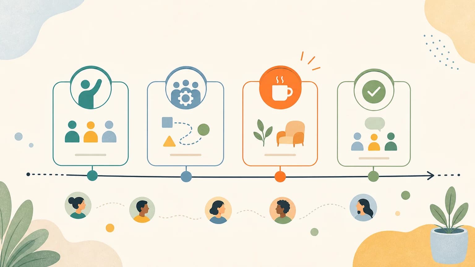
If you are starting from a blank page, use this order: title, short promise, key details, who it is for, what guests will do, agenda, what is included, what to bring, host note, registration action, FAQ. Then test the page by asking whether a stranger can answer five questions in under one minute: What is this? Is it for me? Can I attend? What happens there? How do I reserve a spot?
| Page section | Question it answers | Signup risk it reduces |
|---|---|---|
| Title and promise | What is this event? | Confusion about format |
| Audience fit | Is this for me? | Fear of being out of place |
| Agenda | What will happen? | Uncertainty about the experience |
| Inclusions and prep | What do I get or bring? | Unclear value or preparation |
| Registration | How do I reserve a spot? | Signup friction |
Create the Page With HereNow
HereNow helps hosts turn a rough event idea into an editable page with a title, description, agenda, visual direction, RSVP settings, and a shareable link. You can start from event templates or draft from one sentence, then refine the page using the sections above. If registration friction is the main concern, review how HereNow supports RSVPs without attendee accounts. For a broader first-host workflow, read how to host your first workshop.
FAQ
What should every event page include?
Every event page should include the event promise, audience fit, date, time, location or online access, agenda, host note, what is included, what guests should bring, capacity or availability when relevant, and a clear registration action. If the event is paid, the page should also make ticket inclusions, policies, and trust details easy to find.
How long should an event description be?
The description should be long enough to answer the main guest questions without hiding the signup action. Many small events need one clear opening paragraph, several scannable sections, an agenda, inclusions, host note, and FAQ. If the page is short but complete, that is better than a long page full of vague mood copy.
What makes people hesitate before signing up?
Common blockers include unclear audience fit, vague agenda, missing logistics, uncertainty about what is included, lack of trust in the host, access or preparation questions, and a registration form that asks too much too soon. The best event pages identify those blockers and answer them before the guest has to message the host.
Should I include a host bio?
Yes, especially when the event asks for payment, participation, vulnerability, or trust. Keep the bio short and relevant to the event. Explain why you are prepared to guide this specific experience, not every achievement you have. A precise host note can build trust even when you are hosting your first public event.
Can AI write my event page for me?
AI can help produce a strong first draft, but the host must verify the details. Date, location, capacity, pricing, access notes, materials, policies, and tone all need human judgment. Use AI to remove blank-page friction, then edit the page around the actual promise, room, guest needs, and registration path.